Common Unity
This is a live brief from Briefbox.
Common Unity is a Leeds based record shop and label set up in 2004. The aim of the shop has always been to represent the thriving dance music scene in the city by supporting local artists and DJs.
The Brief
The client wanted a fresh, exciting brand identity that reflects their ethos of community, boundary-pushing music and great looking street wear. They want to attract artists and customers that share the same vision and would like to see how the new brand would work across the various aspects of their business.
The Solution
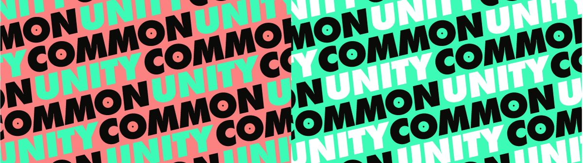
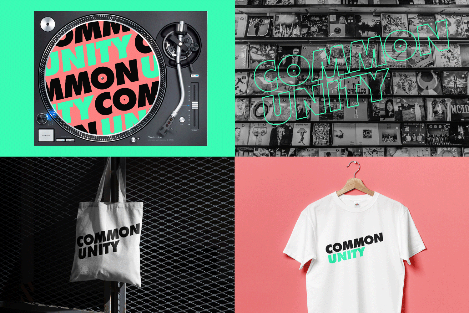
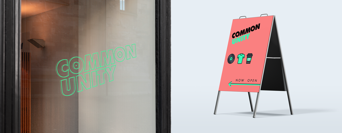
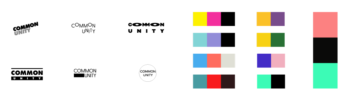
A bright, bold approach that reflects the boundary-pushing element of the store/label as well as a profile which represents youth and dance culture alike. The 'O's in Common represent records and the shape of the logo resembles a turntable stylus.
The process started with sketching out ideas for a logo on paper before translating some of those digitally. After having a few options I moved to the colour palette. Because of the nature of the client I went for bright and bold colours. After having a selection of palettes, I applied each one to the stand-out logo, before deciding on the final colours.
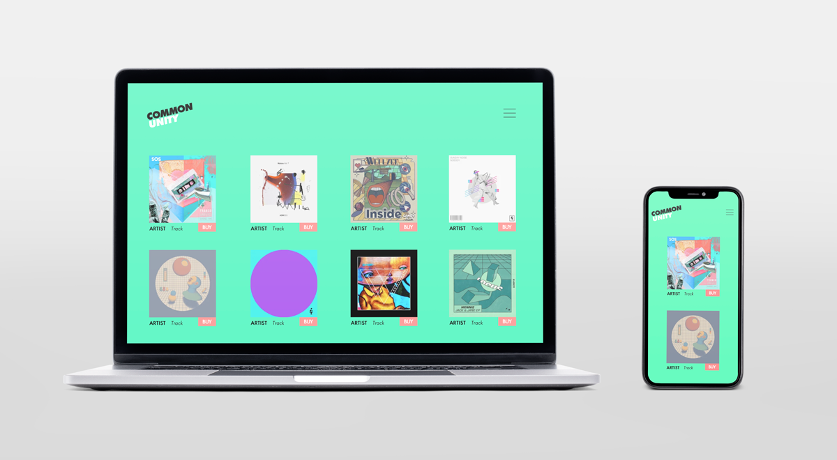
Then using the new logo and palette I did some brand exploration using applications that would be used by the client like slipmats, tote bags, signage and UI.