Perci Health
The Logo
It all started with a logo. There was a logo already in place which I inherited when I joined during Perci’s early days. It formed a good basis but was decided a single-colour approach was cleaner. Perci plain is used in owned channels whereas the full Perci Health for everything else. Finally the Perci ‘P’ is used as the symbol and represents a questionmark in FAQs, Q&A pieces etc.
The Palette
Athough a palette was in place along with the original logo, it felt techy and corporate with too many options. The approach was a narrower selection of softer and less corporate colours which felt better suited for the sector Perci would be operating in.
Typography
Even though the brand originally used a combination of Google Fonts, the look and feel that was created wasn’t very streamlined with legibility issues with the main font and being part of the widely used Google Fonts suite, they felt unoriginal. Sofia Pro offers a clean and versatile alternative. It was narrowed down to three variants broadly assigned the Light variant for body copy, Regular for CTA buttons and Semibold for titles and text links.
Iconography
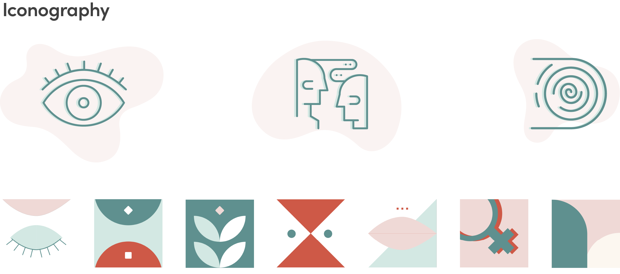
In addition to UI icons the brand toolkit also consisted of elevated versions for use in marketing, social etc. Another bespoke set of abstract symbols was created, one for each of the services provided by Perci. Some of the concepts included Dietetics, Psychosexual, Psychology, Hypnotherapy, Speech therapy and more.
Visual Identity
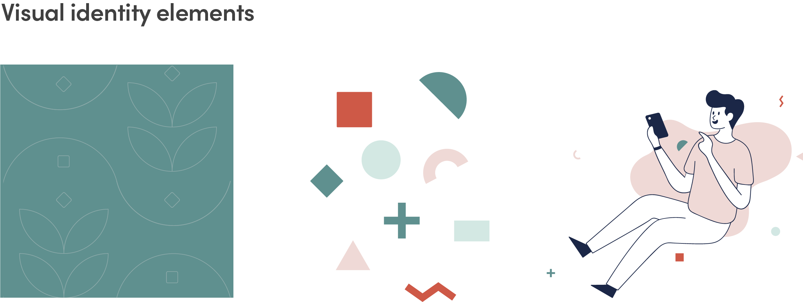
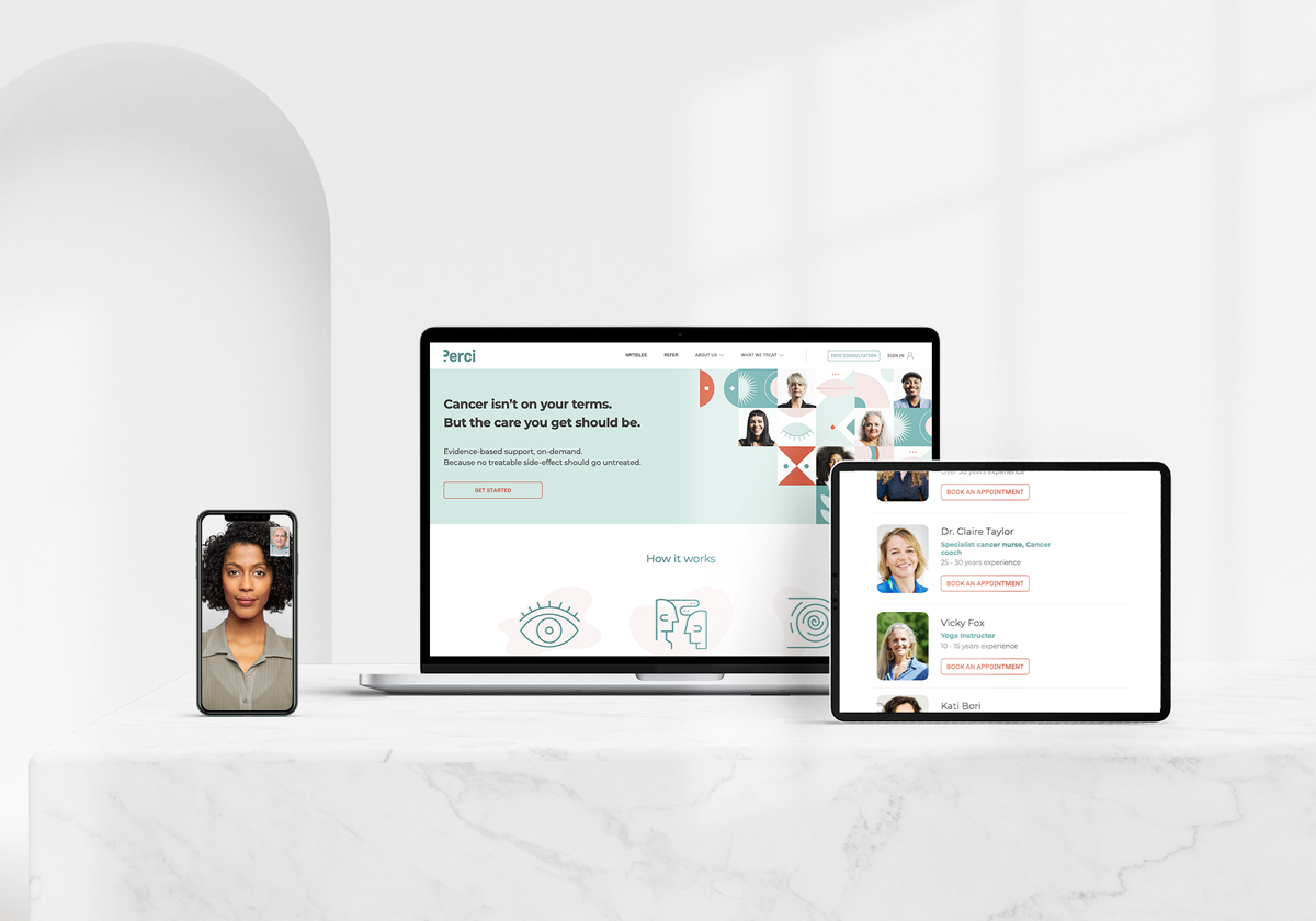
Other elements of the brand include the texture, used as a background on large areas of otherwise plain colour and a selection of shapes which came from the deconstructed services icons above. Some illustrations were introduced too but these were curated and adapted to the Perci brand from sourced artwork. A duotone lens was also introduced to treat images used in artwork.
Selected work
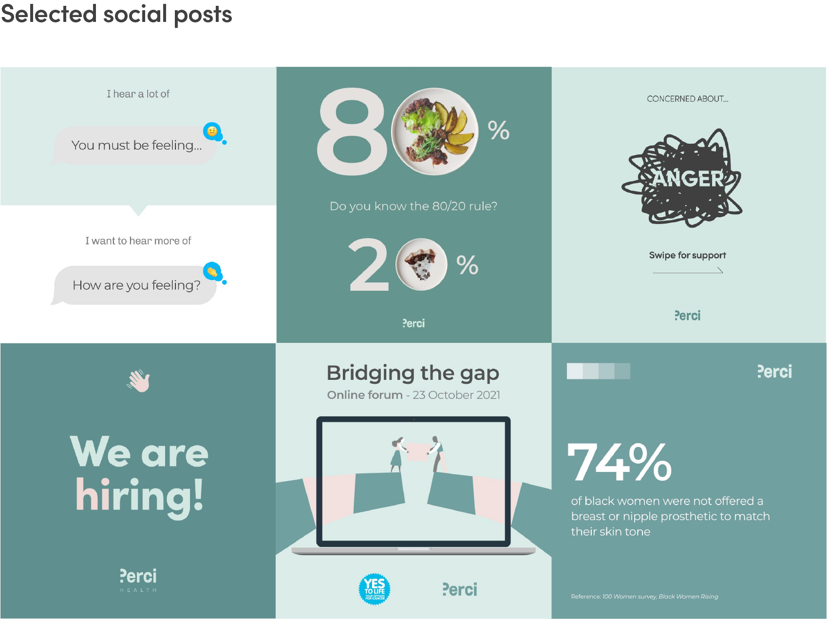
Social
Paid digital ads - Facebook & LinkedIn carousels
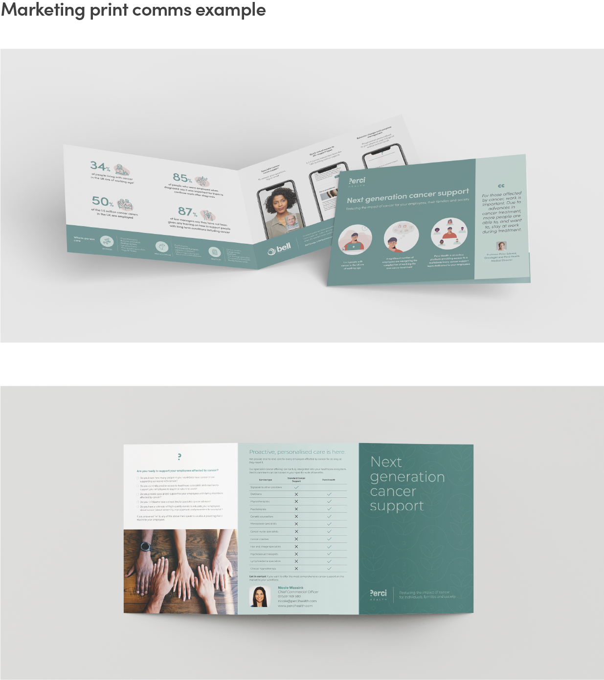
Marketing Communications
Responsive Web/UI